SplitMart: a SaaS product redesign in code, after a UX audit
I redesigned the product from audit to production-ready code, which the client's developers used.
SplitMart is a two-sided fitness marketplace: clients book local training sessions pay-per-session, trainers list services and get paid.
That means a UX audit that found the leaks costing bookings, a full redesign of the screen system, a brand landing, a documented design system, and the production build itself across React and native iOS. All of it was designed in a real browser, at real breakpoints.
React 19TailwindAnt DesigniOS Claude Code
Walked the product as a client and as a trainer, found 37 problems. Three of them were leaking bookings directly, so I fixed them first.
Rebuilt booking: the price and open slots are visible before sign-up, not after. Fewer reasons to leave the page.
Took it from audit to a live product: a React build and native iOS, both deployed and public.
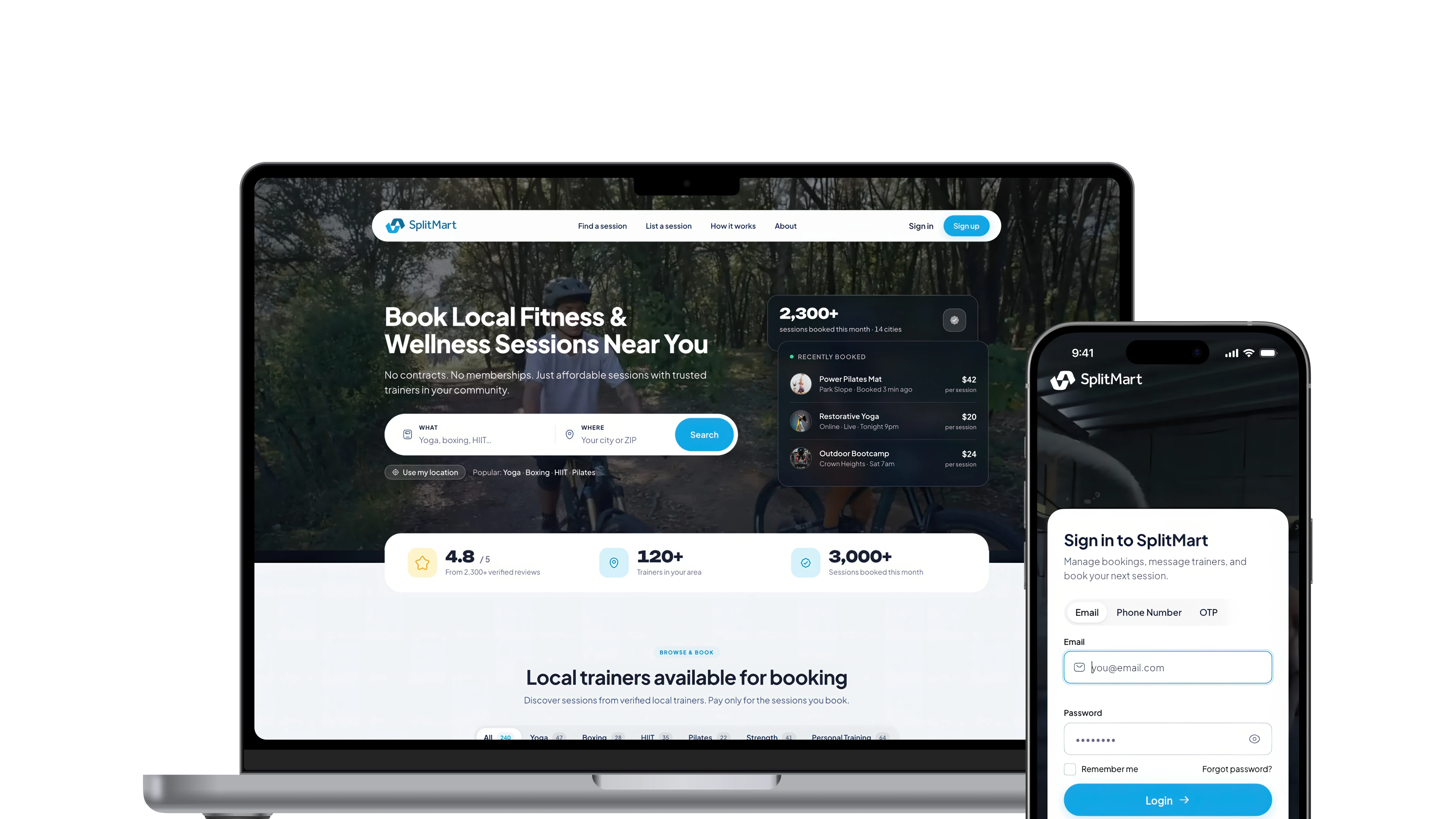
UX audit
The product audit returned 37 findings, and three of them directly caused clients to drop off during booking.
I walked the end-to-end flows as both a client and a trainer, on desktop and mobile, then ran a heuristic pass and assembled a prioritized report with severity and effort.
The pass covered navigation, hierarchy, friction, empty and error states, forms and accessibility. The three critical findings:
- A premature auth wall. "Book Now" threw the user to Sign In before they had picked a slot or seen a price.
- The mobile detail page hid the title and price. The highest-intent screen showed a video and a button, but no session name and no dollar amount above the fold.
- Broken mobile navigation. The primary entry points disappeared at the mobile breakpoint with no hamburger.
Issues the audit found
Where
Redesign
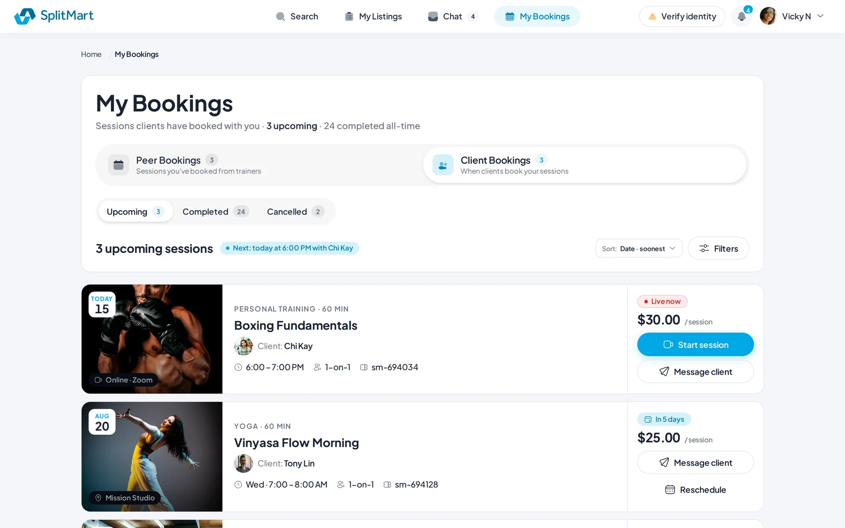
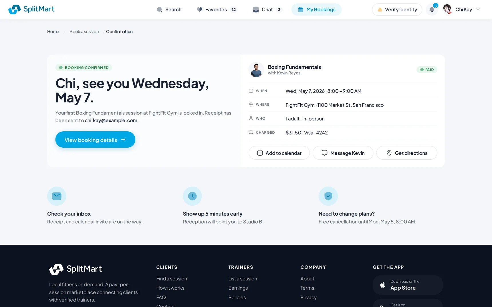
I rebuilt the booking flow so price and open slots come before sign-up, not after it.
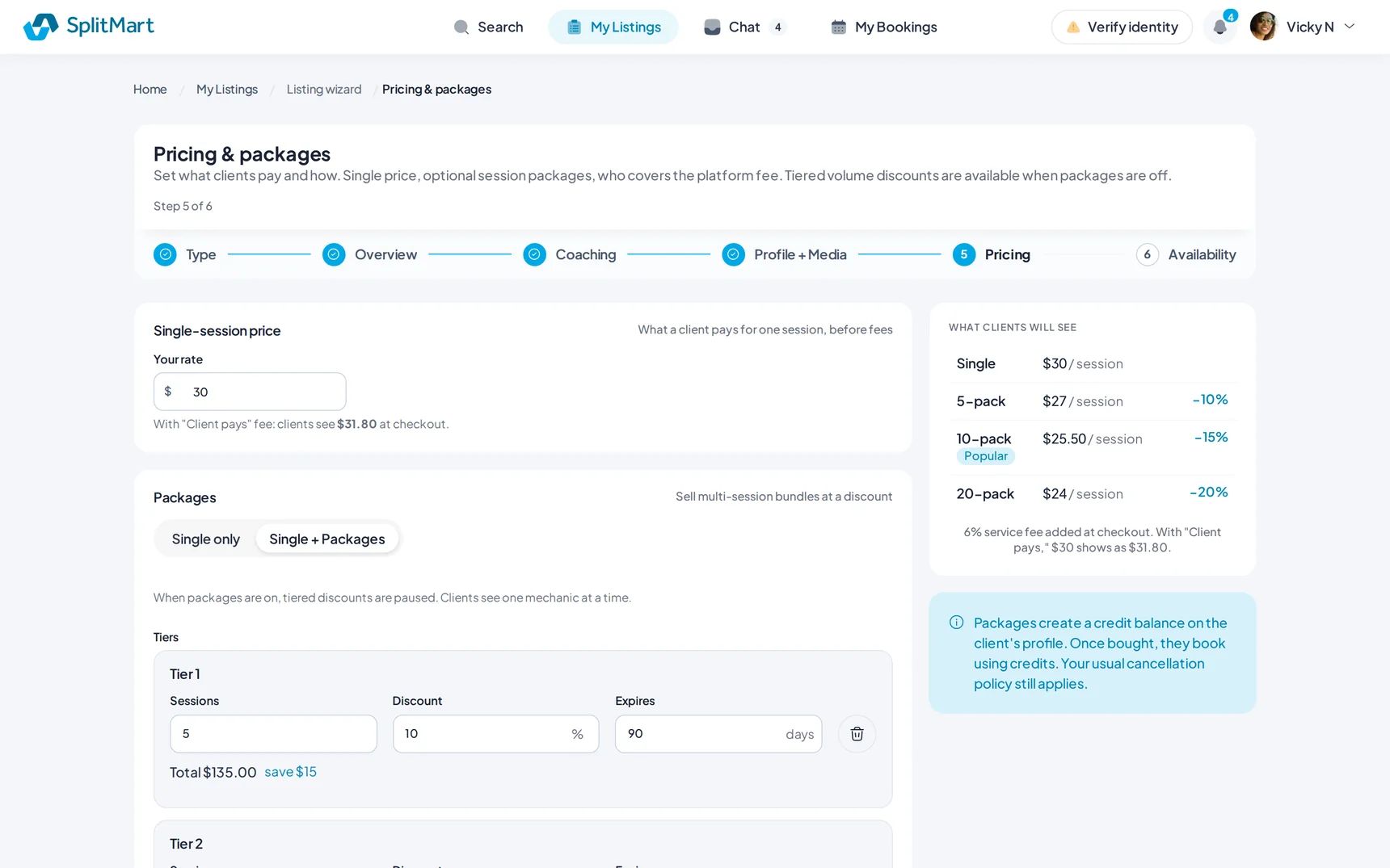
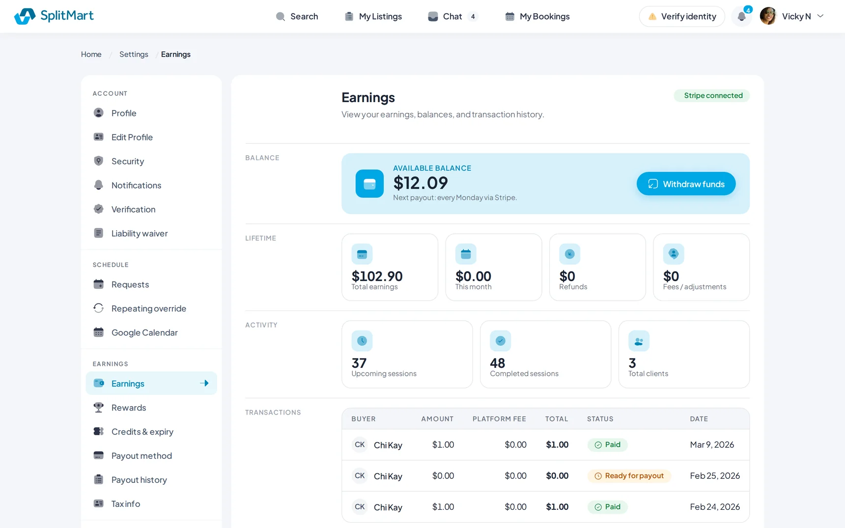
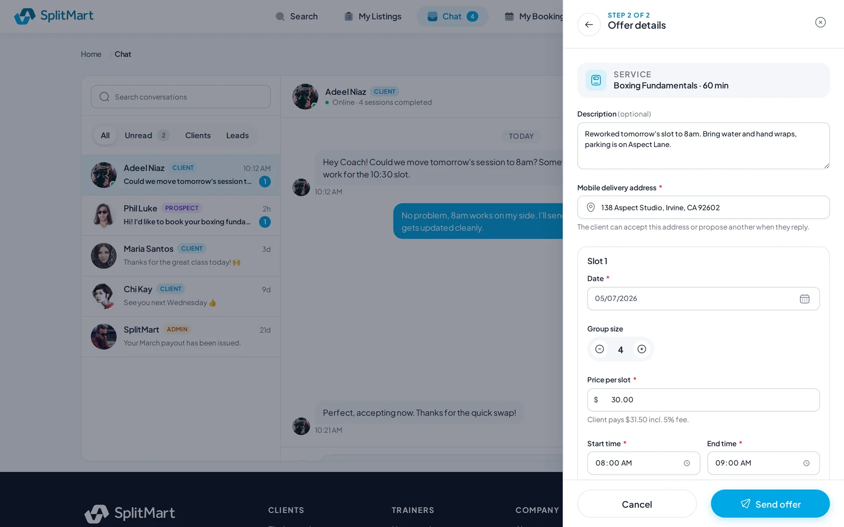
I rendered about 303 screens in a real browser through a role-aware shell: booking, search, listings, the session page, settings, chat, the listing wizard, earnings and both dashboards.
The design system carries its own guardrails: an anti-slop set of 37 banned patterns plus canonical patterns, a type system and a mobile adaptation playbook, so "good" became measurable rather than subjective.
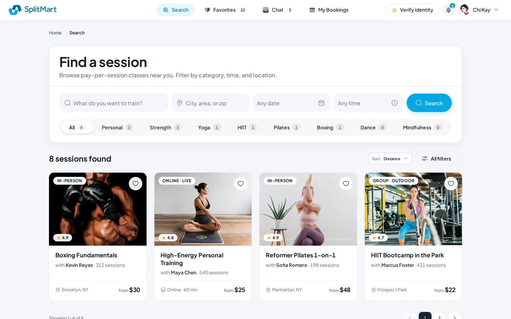
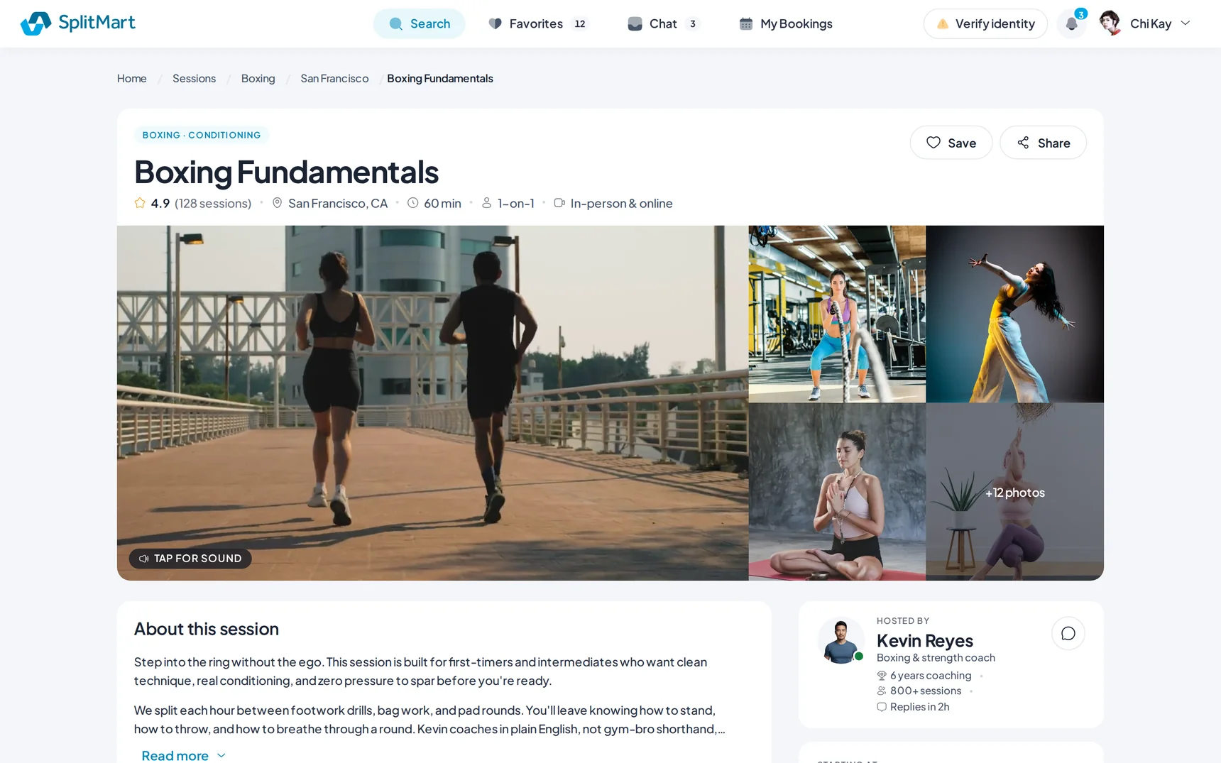
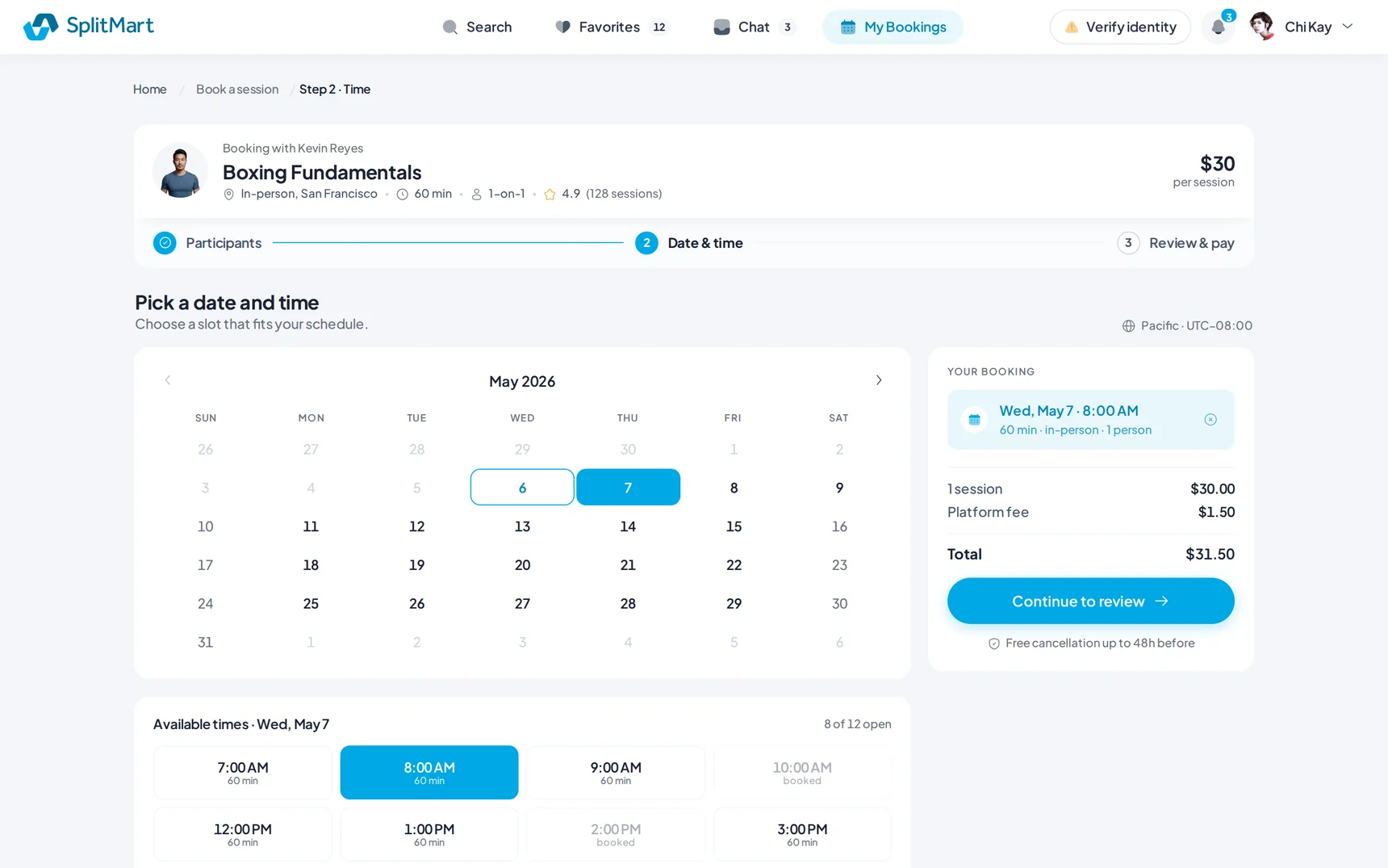
Production build
I shipped both builds publicly: React across ~103 routes and a native iOS app.
These are production-quality builds with demo data, not a product with a live audience, and every screen in them is real.
React 19, Vite, Tailwind v4 and Ant Design 6, with design tokens instead of hardcoded values. iOS is assembled only from my own iOS components and tokens: web and iOS share the user flow, not the code, so the app feels native rather than a wrapped web view. The trainer MVP scope dropped from six features to three after a live audit of what the product already did.
- splitmart-react.vercel.app — production React build
- splitmart-ios.vercel.app — native iOS app
- redesign-scope.vercel.app — web prototype
- github.com/denysosadchyi/splitmart-react — the code